Categories
- All Categories
- 5 Oracle Analytics Sharing Center
- 11 Oracle Analytics Lounge
- 195 Oracle Analytics News
- 41 Oracle Analytics Videos
- 15.5K Oracle Analytics Forums
- 6K Oracle Analytics Idea Labs
- Oracle Analytics User Groups
- 68 Oracle Analytics Trainings
- 14 Oracle Analytics Data Visualizations Challenge
- Find Partners
- For Partners
Line graph enhancement - add options for different marker/point shapes

While the available options for setting different line colors, widths and patterns per metric in a line graph are great, there is currently only a viz-level option for turning on line markers/points. Being able to also choose markers/points with different shapes per metric would address a functionality gap between OAC and other reporting tools.
Business case:
Many times lines in a line graph can track very closely and/or overlap with each other. Even when using different line patterns it's easy to lose sight of overlapping lines. Being able to add markers of different shapes (triangles, squares, diamonds) could help differentiate lines in these cases.
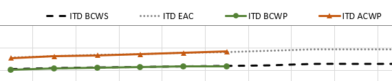
PowerPoint example:
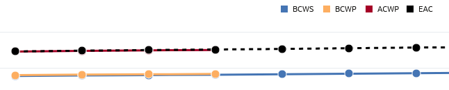
Current OAC viz example:
Comments
-
-
Great idea. It'll be a great feature to have. Upvoted.
1 -
Agree good idea, will work with product management @Avinash Krishnaram-Oracle to consider this. In the meantime you can use conditional formatting to change the point colors and make the difference a bit more drastic. Also if you use an overlay chart you can set the line properties independently on each line layer further distinguishing each line.
 2
2 -
Thank you @Matt Milella-Oracle , I didn't even think about adding layers or conditional formatting, great idea!
1


