Categories
- All Categories
- 5 Oracle Analytics Sharing Center
- 11 Oracle Analytics Lounge
- 195 Oracle Analytics News
- 41 Oracle Analytics Videos
- 15.5K Oracle Analytics Forums
- 6K Oracle Analytics Idea Labs
- Oracle Analytics User Groups
- 68 Oracle Analytics Trainings
- 14 Oracle Analytics Data Visualizations Challenge
- Find Partners
- For Partners
Welcome to the Oracle Analytics Community: Please complete your User Profile and upload your Profile Picture
Incident Dash Board - Pharma Co

Steven Stalley -Oracle
Rank 3 - Community Apprentice
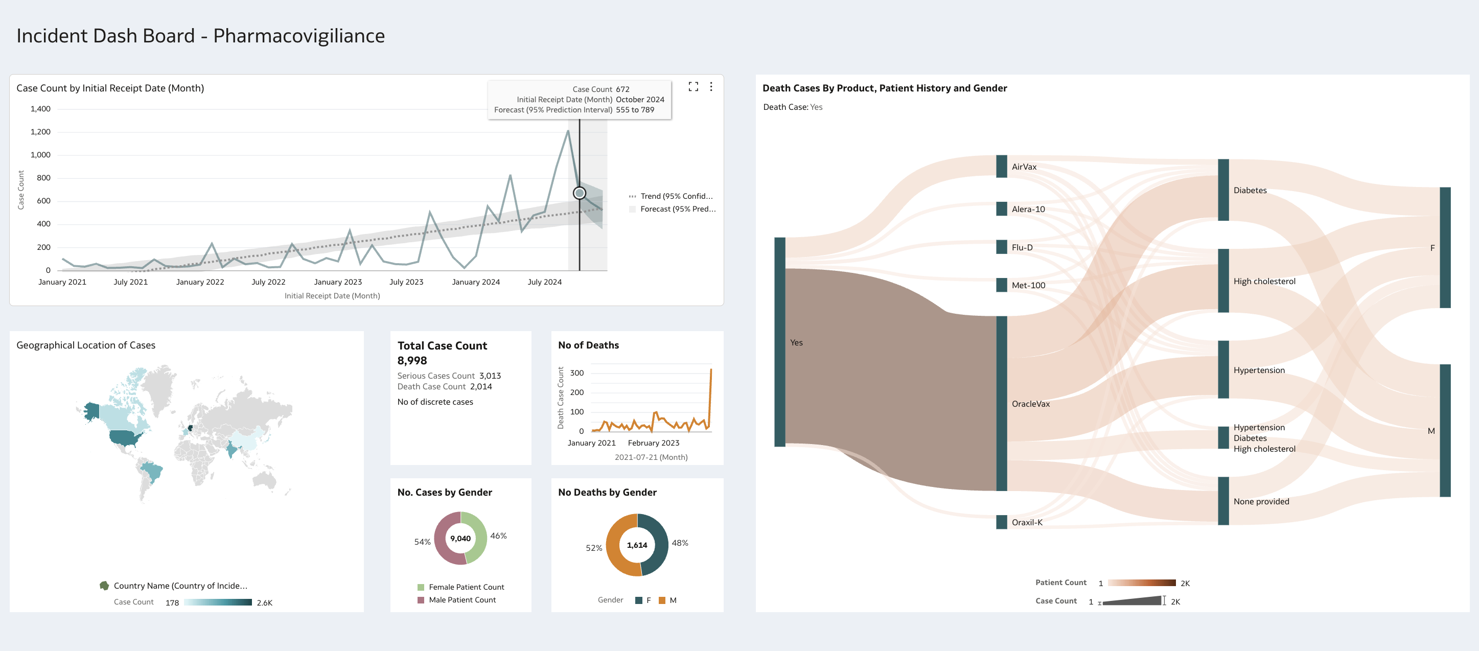
Single interactive dash board highlighting the following KPI's in relation to Case Count and time line with projection trend line, Geography coverage and then specific dashboards on severity and death count reflect a gender split. Then have a sankey diagram further analysis the death case by vaccine, any underlying medical conditions and the Gender.
5
Comments
-
a useful example to enhance my DV building skills
3 -
User13154202-Oracle Thanks for sharing!
2 -
@User13154202-Oracle This is a great visual! Thank you for sharing 😀
2 -
Beautiful Viz.
Great work & Thanks for sharing @User13154202-Oracle!
1 -
Excellent work @Steven Stalley-Oracle! I like the use of the sankey
1


