Categories
- All Categories
- 5 Oracle Analytics Sharing Center
- 11 Oracle Analytics Lounge
- 195 Oracle Analytics News
- 41 Oracle Analytics Videos
- 15.5K Oracle Analytics Forums
- 6K Oracle Analytics Idea Labs
- Oracle Analytics User Groups
- 68 Oracle Analytics Trainings
- 14 Oracle Analytics Data Visualizations Challenge
- Find Partners
- For Partners
US Sales Dashboard - Webinar June 4, 2025

This dashboard was featured in the webinar series beginning Wednesday, June 4th, 2025.
Each session will showcase a community submission, and our experts from the Oracle Analytics Customer Excellence and Oracle Design teams will dive into what makes these visualizations stand out. They will also provide valuable insights and tips to enhance the data visualization submission using the latest Oracle Analytics features and design best practices.
Note that community submissions are pre-approved by the user to be featured in this webinar prior to the event.
Watch the replay here.
Special thanks to our design expert, @Dustin Bauder, and the Oracle Analytics Data Visualization Community Creator, @Cyrille Saulnier-Oracle for their significant contributions to this visualization!
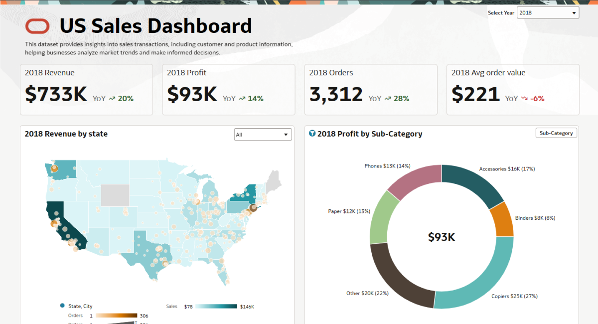
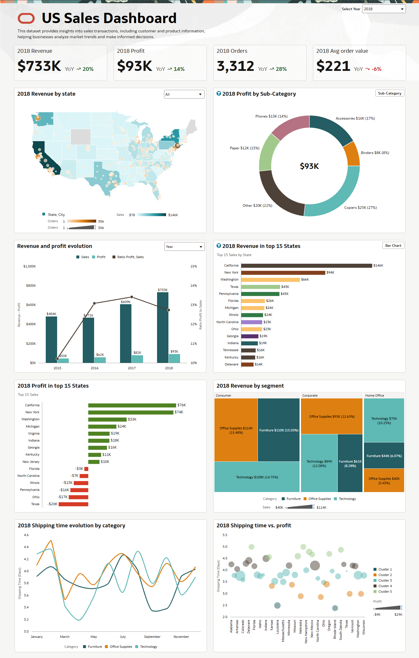
Optimized Dashboard:
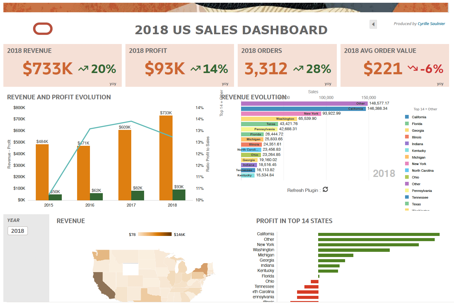
Original Dashboard:
Key Takeaways from This Webinar:
- For the new dashboard we used a freeform layout to be able to have more flexibility on the design. [Learn more]
- You can use Present mode to specify how you want the workbook to display to the consumer and how the consumer navigates and interacts with the workbook. [Learn more]
- You can specify which filters to apply to a visualization. [Learn more]
- You can embed a parameter in a calculation [Learn more]
- You can use a parameter to hide or unhide a visualization. [Learn more]
- You can display the parameter value directly in text boxes or chart titles. [Learn more]
- You can customize tooltips to create better narratives. [Learn more]
- You can enable contextual insights so users can drill down inside the visualizations. [Learn more]
Slide Deck:
DVA File (Compatible with OAC instances from July releases):
If you have questions about other features displayed during this webinar please feel free to reach out.
Check out the event page for more information about this webinar series.
Comments
-
Excited for this webinar series! I’m looking forward to gaining practical tips to enhance the appeal and effectiveness of my data visualizations!
4 -
Really nice Dashboard. Can't wait to watch how it has been built.
3 -
Looking forward to the webinar!
3 -
Really appreciate the webinar.. thanks for the great insights, particularly around the use of parameters and the overlaying of filters on vizualizations..
3 -
Nice dashboard and great webinar showing it. I arrived late but still interested in know how things were done, especially the part where you can change visualizations within as shown in the 2018 Revenue in top 15 States from a bar chart to whatever the other one was (can't remember now hence the need for the replay, LOL). I'm hoping it can simply change from a pivot table with one dimension to another with two but the same metrics.
2 -
Very nice Dashboard,
When we can see online the webinar?. I'm interested in understanding how the donut chart was created to switch between category and sub-category, it was really nice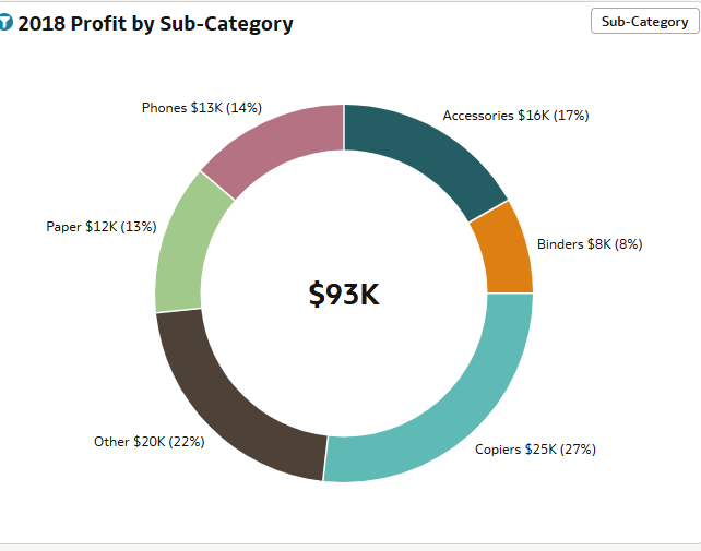 3
3 -
@User_2PHPN - The goal is to have the webinar posted for replay by June 11, if not earlier.
1 -
Thanks for the feedback @User_2PHPN, feel free to send me an email, we can set up a quick call so I can demo this live to you :)
0 -
Webinar replay link here!
3 -
Thank you @Jamie Anderson-Oracle for that quick turn around.
0


