Categories
- All Categories
- 5 Oracle Analytics Sharing Center
- 11 Oracle Analytics Lounge
- 196 Oracle Analytics News
- 41 Oracle Analytics Videos
- 15.5K Oracle Analytics Forums
- 6K Oracle Analytics Idea Labs
- Oracle Analytics User Groups
- 68 Oracle Analytics Trainings
- 14 Oracle Analytics Data Visualizations Challenge
- Find Partners
- For Partners
OAC - show values with 2 different granularities in the same viz

Hello,
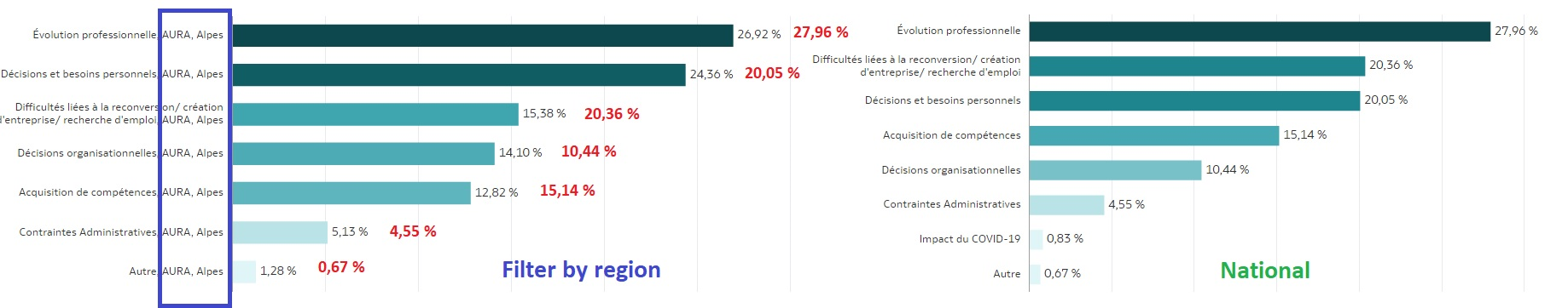
There is a way to display the pourcents of a quiz on the same visualisation (Regional vs National) to avoid to duplicate them? I have many question to represent and putting all side by side it's not very pretty.
I would like to display the red values on the left graph also. Make a text box for each value (with a filter) it's not an option for me because I can apply a filter and sometimes I don't have all the values on the left side ( 3 bars on a region vs 8 bars on national version). All the static values are shifted each time.
I use 2 differents indicators for each visualisation (from a presentation table and a alias of the same table with different aggregation)
Any suggetions are welcomes: variables, calculations, all that OAC can offer for moment.
Thanks,
Daniel
Best Answer
-
To display chart as you displayed I do not think there is a chart can achieve this (even for other competitors ) what we suggested is to give a near chart to your requirements but will not be 100% match
you also may visit custom extension
But again I can not find what matches your requirements 100%
1

Answers
-
What about potentially using an overlay chart to display National vs. Regional?
Bar Graphs
Other comments, welcomed.
1 -
As @SteveF-Oracle Suggested but you can try the Horizontal 100% stacked bar chart
0 -
Hello @Mostafa Morsy-Oracle and @SteveF-Oracle
Can you explain me how I display the red percents(National) near the grey percents (Regional) on the same graph like in my picture using overlay chart or horizontal 100% stacked bar chart?
For my case I use mosly Pie charts et Horizonal Bar charts. Supposing that I have 2 indicators (as values not percents) and a question as dimension:
Presentation table 1 (regional agregation)
- regional responses count - grey
- question 1
Presentation table 2 (national agregation)
- national responses count - red
- question 1
Regards,
Daniel
0 - regional responses count - grey
-
@Daniel Vornicu
One idea is to create a calculated measure that filters based on your criteria (Regional and National), then use the two measure in the same horizontal bar vizualization.
In this simple example, the two measure filters are:
FILTER("PC0"."Revenue Metrics"."Revenue" Using "PC0"."Geography"."Region" = 'AMERICAS')FILTER("PC0"."Revenue Metrics"."Revenue" Using "PC0"."Geography"."Region" = 'EMEA')
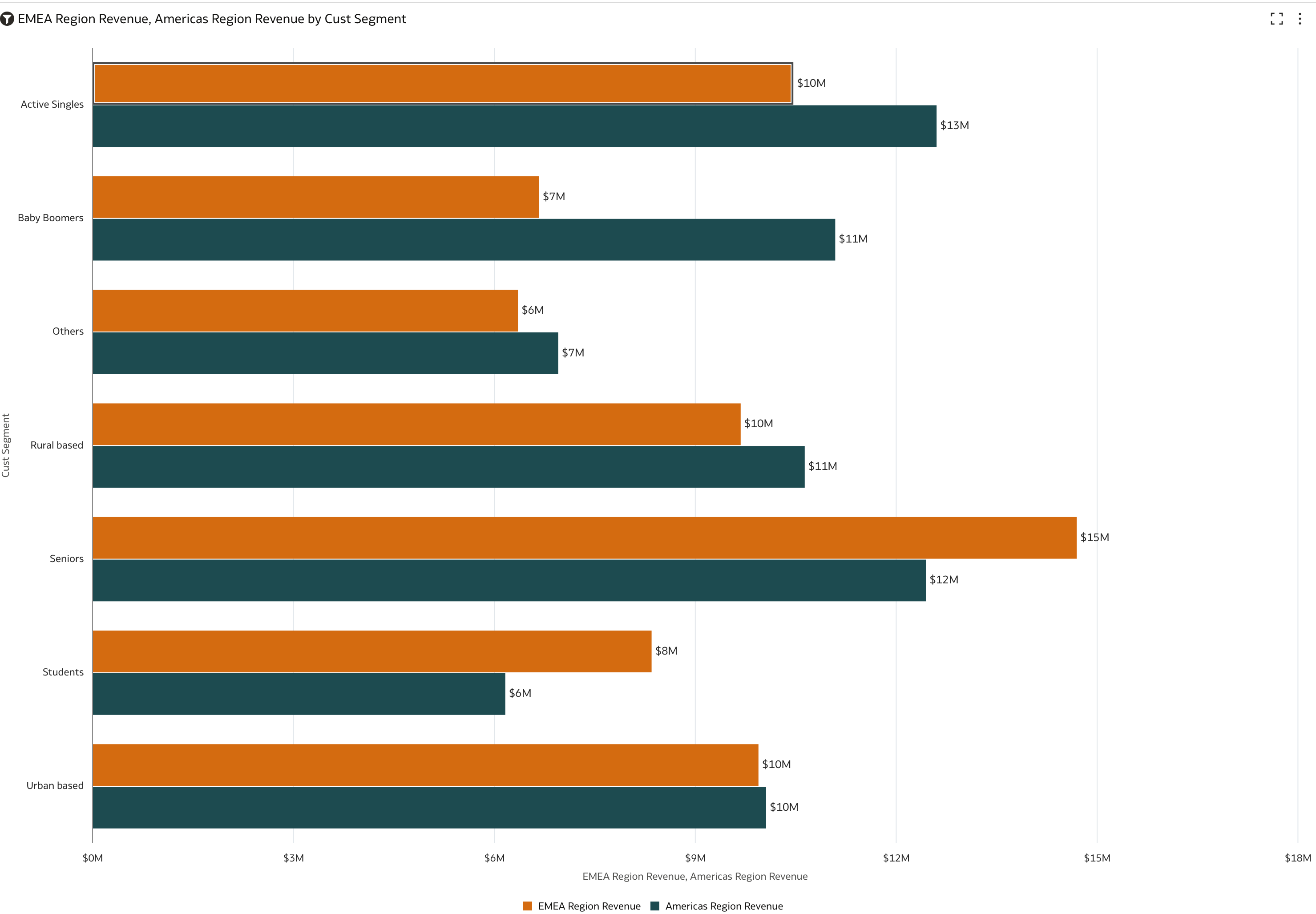
Maybe you can work something similar with your data.
You can also add notes and commentary, if you need to add contextual information.
Add Notes to a Visualization0 -
Hello,
Like I said I already have the 2 mesures and I want to use mostly Horizontal Bar Graphs and Pie Graphs.
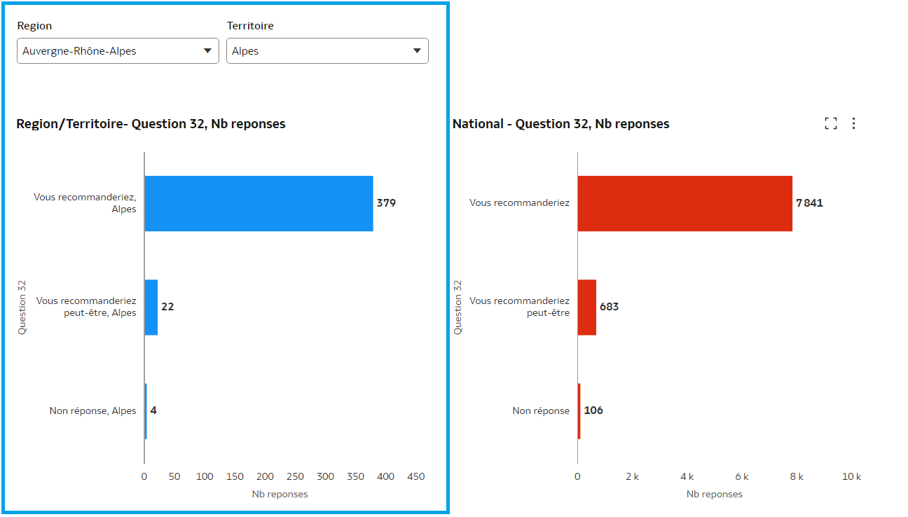
In the image bellow I want to keep only the left side graph that is filtered by region ans territory (in blue rectangle). It's the only dynamic graph (when I modify the filter)
The other graph (in red) is static so I just want just to indicate the national values: 7841, 683, 106 as as second label or something like that (as text near the others values not as distincts bars or separate graph).
Of course I can add 3 separate tiles near each regional values ( 379, 22 and 4) . The problem is that if I choose a region/territory when I have only 1 or 2 answers the 3 tiles remains in places. This case is simple but if I have a question with 10 possibles answers adding 10 tiles (so 10 sql request behind) it's not a valid solution.
In my case the quiz contains 35 questions so the ideea is that I don't want to duplicate each vizualiation. I want to keep only the dynamic graphs and find a way to indicate the national anwers as reference.
Thanks,
Daniel
0 -
Thanks Daniel, note taken and your unique use-case has been presented to the appropriate PM.
Please also fee free to file an Ideas Lab request to formalized the use-case example.
I don't think a tooltip that is based based on your reference measure will work in this case. Only a static note0
